
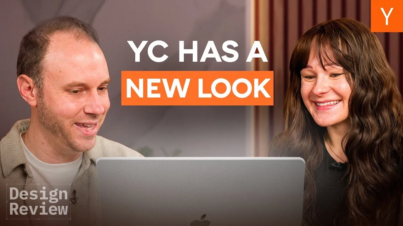
Table of Contents
Redesigning the digital front door of Silicon Valley’s most prominent startup accelerator is not merely an exercise in aesthetics; it is a challenge in narrative philosophy. When Y Combinator (YC) decided to overhaul its website, the goal was not simply to update a tech stack or refresh a color palette. The objective was to fundamentally shift how the organization communicates with the next generation of founders. Moving away from a utilitarian, B2B-style interface, the design team embarked on a project to humanize the startup journey, leveraging modern AI tools to bypass traditional design bottlenecks.
The resulting platform is a case study in how heritage brands can modernize without losing their soul. By balancing 13-year-old copy written by Paul Graham with cutting-edge interactive storytelling, the new site prioritizes inspiration over information density. This redesign process also highlights a burgeoning trend in product design: the transition from static prototyping tools like Figma to live, AI-assisted coding environments.
Key Takeaways
- Shift from Utility to Inspiration: The redesign moves away from a transactional, "B2B SaaS" aesthetic to focus on the emotional arc of the founder's journey, aiming to make visitors "dream" rather than just consume data.
- Humanizing the Data: Instead of displaying cold lists of company logos, the new site highlights the founders behind them, emphasizing their humble beginnings to make success feel attainable.
- AI as a Design Partner: The design team largely bypassed high-fidelity Figma mockups, opting instead to build live prototypes using AI coding assistants (specifically within Cursor), allowing for rapid iteration on complex interactions.
- Timeless Messaging: Despite the visual overhaul, the core explanatory text remains the original copy written by Paul Graham over a decade ago, proving that foundational mission statements often outlast design trends.
Escaping the "B2B SaaS" Trap
The previous iteration of the YC website, designed during the COVID-19 pandemic, served its purpose as a functional resource. However, upon internal review, the team recognized that the site had drifted into a "utilitarian" aesthetic common among B2B software companies. The layout relied heavily on standard conversion optimization tactics: a hero image, a block of text, a list of statistics, and a wall of logos.
While efficient, this approach failed to capture the unique ethos of the accelerator. The "Top Companies" section, for instance, listed billion-dollar entities but stripped away the context of their creation. It presented results without showing the struggle or the trajectory.
We show the logos, but we don't really talk about the founders who built these companies. YC was pivotal in the trajectory of all of these companies, and it's something that was a little bit underplayed in the original design.
Furthermore, the messaging had inadvertently become defensive. Key value propositions were framed in the negative—focusing on what YC doesn't do (e.g., "we don't take a board seat") rather than affirmatively stating the value provided. The redesign aimed to flip this dynamic, quantifying success and focusing on the positive transformation founders undergo during the batch.
The Philosophy of "Formidable"
To steer the art direction, the team revisited the organization's roots, specifically studying the essays of co-founder Paul Graham. A recurring theme in those early writings was the concept of the "formidable" founder. This adjective became the north star for the visual identity, influencing a shift toward a minimalist, airy design that allows the content to breathe.
Visualizing Transformation
One of the most critical additions to the new site is the "Before and After" section. Rather than simply stating that YC helps companies grow, the design visualizes this trajectory. The interface displays founders at the start of their journey—often working out of apartments or dorm rooms—contrasted with their current status as leaders of generational companies.
This design choice serves a specific psychological purpose: it bridges the gap between the visitor and the success story. By showcasing the "humble beginnings," the site signals to prospective applicants that they do not need to be polished CEOs to apply. The message is implicit but clear: "I could do this."
Interactive Testimonials
Moving away from generic endorsements, the team interviewed recent alumni to capture the visceral experience of the batch. These snippets were woven into a continuous narrative stream rather than isolated pull quotes. The goal was to remove the corporate filter and let the founders' voices carry the weight of credibility.
We didn't want to say a bunch of things about how great YC is. Instead, we wanted to just have the founders' stories communicate that. It makes it a lot more credible and believable when it comes from them rather than us saying it about ourselves.
Integrating AI into the Creative Workflow
Perhaps the most significant revelation from the redesign is the process by which it was built. Traditionally, web design follows a linear path: mood boarding, static wireframing in tools like Figma, and finally, hand-off to engineering. The YC team disrupted this flow by bringing AI into the loop as a "co-designer."
From Figma to Live Code
The team found that static design tools imposed constraints on their creativity, particularly regarding complex animations and interactions. They realized that spending hours perfecting a static image of a website was less efficient than prototyping the actual experience.
Using the AI-powered code editor Cursor (and referencing models like "Opus 4.5"), the designers moved directly into the codebase. This allowed them to prompt the AI with high-level directives—such as "display this information creatively"—and instantly review coded iterations. This workflow shifted the focus from pixel-pushing to interaction design.
We ended up not spending a lot of time in Figma... We realized that it would be probably more efficient to create a brand new repo and then just chat with Opus in Cursor and see what it can cook up for us.
Animating History
This technology-first approach extended to the visual assets as well. The team utilized AI video generation tools to subtly animate historical photos of YC partners and founders. The challenge was to make these static images feel "alive" without distorting the subjects' faces, a common issue with generative video.
By using specific tools recommended by YC alumni (specifically a tool identified as "One"), they achieved a level of fidelity that preserved the likeness of the subjects while adding a layer of engagement. This playful use of technology reinforces the brand’s identity: YC is serious about success, but the culture remains fun, experimental, and deeply rooted in tech.
Bridging the Past and Future
Despite the modern tooling and interactive elements, the redesign demonstrates a deep respect for institutional history. In a move that defies standard marketing advice to "refresh copy frequently," the team retained the exact descriptive text written by Paul Graham over a decade ago.
This decision underscores a vital branding lesson: if the core mission hasn't changed, the core messaging shouldn't either. The original copy, which describes the atmosphere of the batch and the nature of funding, remains as relevant today as it was 13 years ago. The design serves to elevate this text, not replace it.
The "Never Too Early" Call to Action
The site culminates in a strategic simplification of the call to action. A common misconception among founders is the belief that they need revenue, a polished product, or a complete team before applying. The new footer confronts this hesitation directly with the phrase: "It's never too early to apply."
By removing friction and reassuring applicants that ideas are sufficient currency, the design aligns perfectly with the operational goals of the accelerator. It invites raw potential rather than demanding polished perfection.
Conclusion
The redesign of the Y Combinator website is a testament to the evolving nature of digital product design. It signals a move away from the rigid, template-based structures of the past decade toward a more fluid, narrative-driven web. More importantly, the project highlights a shift in how the web is built.
As AI tools become more capable, the line between "designer" and "developer" continues to blur. The ability to prototype interactions in live code allows for a richness of expression that static tools simply cannot match. For YC, the result is a site that honors its formidable past while using the tools of the future to inspire the next generation of builders.
