
Table of Contents
If you have been "vibe coding" with tools like Google AI Studio, Claude Code, or Lovable, you have likely encountered a common frustration: the functionality works, but the aesthetics fall flat. The result is often what critics call "AI slop"—functional software that looks generic, robotic, and devoid of soul. To build products that users actually fall in love with, you must bridge the gap between rapid AI engineering and high-end agency design.
The secret lies in an emerging workflow that combines the logic of LLMs with specific visual generation tools like Weavy AI. By shifting your focus from "what the app does" to "how the app feels," you can create jaw-dropping interfaces that look hand-crafted rather than machine-generated. This guide outlines a comprehensive workflow used by top designers to transform a basic one-shot prototype into a polished, market-ready product.
Key Takeaways
- Start with feeling, not function: Before generating UI, define the emotional resonance of the app using Claude to create a "brand prompt" rather than a corporate style guide.
- The Anchor Image strategy: You do not need a complex design system; often, a single compelling image found on platforms like Cosmos can dictate the entire visual identity.
- Leverage Weavy AI for assets: Use node-based tools like Weavy AI with models like Flux 2 Pro to generate specific UI assets (buttons, textures, icons) rather than full screens.
- Iterate with specialized models: Use Flux for textures and imagery, but switch to Ideogram for typography and logos to avoid the "garbled text" issue common in AI art.
- Composite in Figma before Coding: Don't rely on the LLM to design the layout. Assemble your AI-generated assets in Figma first, then feed that reference back to Google AI Studio for the final build.
Defining the Soul of the Application
Most developers stop once the application functions. For example, if you ask Google AI Studio to build a voice journaling app, it will produce a list of recordings and a microphone button. It works, but it feels like a utility, not an experience. To design something people actually want to download, you must establish the "vibe" before writing a line of code.
Using Claude as a Creative Director
The first step is moving beyond functional requirements. Instead of listing features, list feelings. Use an LLM like Claude to brainstorm the emotional profile of your target user. For a voice journaling app, the user might be an "over-thinker" who craves an analog, non-digital space to vent.
"I define how something should make you feel. Even though that sounds like a little designer hippie-dippy, it's really not... You don't really think of your favorite products in the world and think, 'Oh, it does this.' You think, 'Oh, it makes my life easier and I just feel so good using it.'"
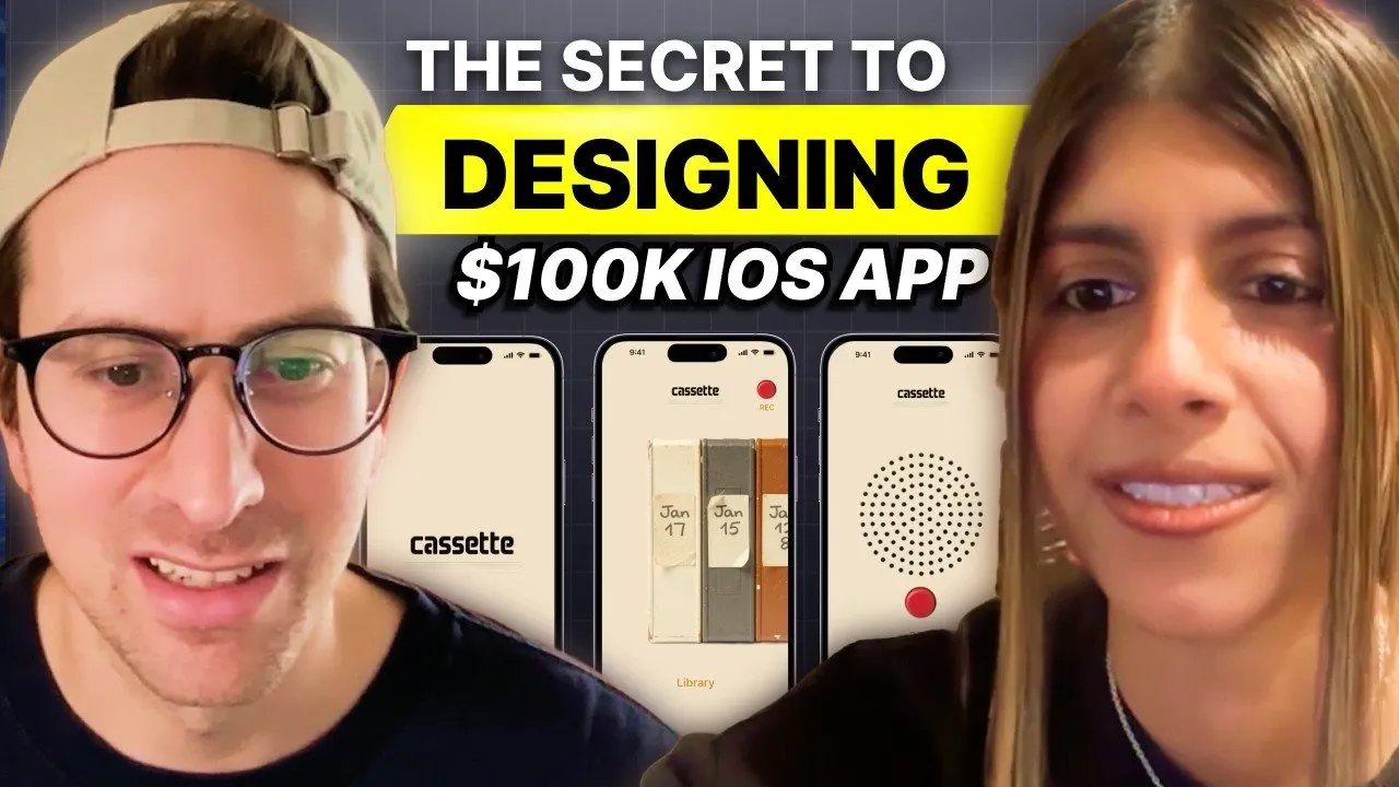
Ask Claude to act as your brand strategist. Input your target audience and ask for keywords that define the aesthetic. In the case of the "Cassette" app, the keywords were "analog warmth," "unpolished," and "tactile." This informs you immediately that standard iOS components will fail here; you need texture and retro elements.
The "Anchor Image" Method
Traditional design involves complex mood boards. In the AI workflow, you can simplify this significantly. Use visual discovery engines like Cosmos (a Pinterest alternative) to find a single "Anchor Image." This could be a photo of a vintage Braun record player or a specific cassette tape. This single image can serve as the source of truth for your color palette, lighting, and texture for the entire project.
Generating Assets with Weavy AI
Once you have your anchor image and brand vibe, the next step is asset generation. This is where tools like Weavy AI shine. Weavy is a node-based interface that allows you to chain different AI models together, giving you granular control over the output that standard chatbots cannot provide.
Extracting Color Palettes and Textures
Instead of manually picking hex codes, feed your anchor image into Weavy AI using the Flux 2 Pro model. Prompt the model to extract a color palette or generate textures based on the reference. This ensures that every button and background you generate shares the same DNA as your inspiration.
For the "Cassette" app, the goal was to create a digital product that felt physical. A unique concept developed during this phase was the idea of "digital aging."
"Digital products are kind of like cartoons. It's like The Simpsons never got older, but time went on... What if the anchor of our visual system is like, as you use the product more, this becomes more used visually?"
By prompting Flux to show "a more used version of this audio system," you can generate assets that look worn or loved over time, adding a layer of depth that CSS gradients simply cannot replicate.
Creating UI Components
Do not ask AI to "design a screen." Ask it to design components. Isolate specific elements you need:
- Buttons: Prompt for a "red analog record button, top-down view, 1980s plastic texture."
- Data Visualization: Instead of a standard list view for voice notes, generate a stack of cassette tapes where the spine labels serve as the date stamps.
- Backgrounds: Generate textured surfaces that match your color palette.
By generating these elements individually, you maintain control over the layout while leveraging AI for the difficult texture and lighting work.
Typography and Logo Design
One of the historical weaknesses of AI image generators is text. However, newer models have solved this. When moving from image assets to logos and typography, switch your model from Flux to Ideogram v3.
The Power of Negative Prompting
When generating logos, describing what you don't want is just as important as describing what you do want. To achieve a clean, modern, or retro look, use negative prompts to filter out the default "AI aesthetic."
Common negative prompts should include:
- 3D render
- Glossy
- Gradient mesh
- Sparkles
- Corporate Memphis
For the "Cassette" logo, asking for a "technical wordmark, version C, tape label style" while negatively prompting against "3D" and "glossy" produced a professional, vector-style logo in seconds. Once generated, you can use background removal tools directly within Weavy or Figma to isolate the asset.
Compositing and The Final Build
The final stage of the design process is compositing. This is where you act as the conductor. Bring your AI-generated buttons, backgrounds, and cassette tapes into Figma.
The "Overlay" Technique
A pro tip for making disparate AI assets look cohesive is utilizing blend modes in Figma. If a generated button feels slightly off-color compared to your background, set the layer style to Overlay or Hard Light. This forces the asset to pick up the lighting and hue of the background texture, instantly grounding the object in the scene.
Closing the Loop with Code
Once your mockups in Figma look polished, you have a visual target. You can now return to a tool like Google AI Studio or Cursor. Instead of asking it to "make a journaling app," you can upload your high-fidelity mockups and provide specific instructions: "Build this interface using the provided cassette metaphor for the history list and this specific red button for recording."
Conclusion
The era of being limited by your ability to draw pixels is over. The role of the designer has shifted from creator to curator. By using Claude to define the soul, Weavy AI to generate high-fidelity assets, and Figma to compose the vision, anyone can "vibe code" an application that looks like it was built by a high-end creative agency.
The barrier to entry for beautiful software has never been lower. The tools are available; the difference now lies in your taste and your willingness to curate the right inspiration.
