Table of Contents
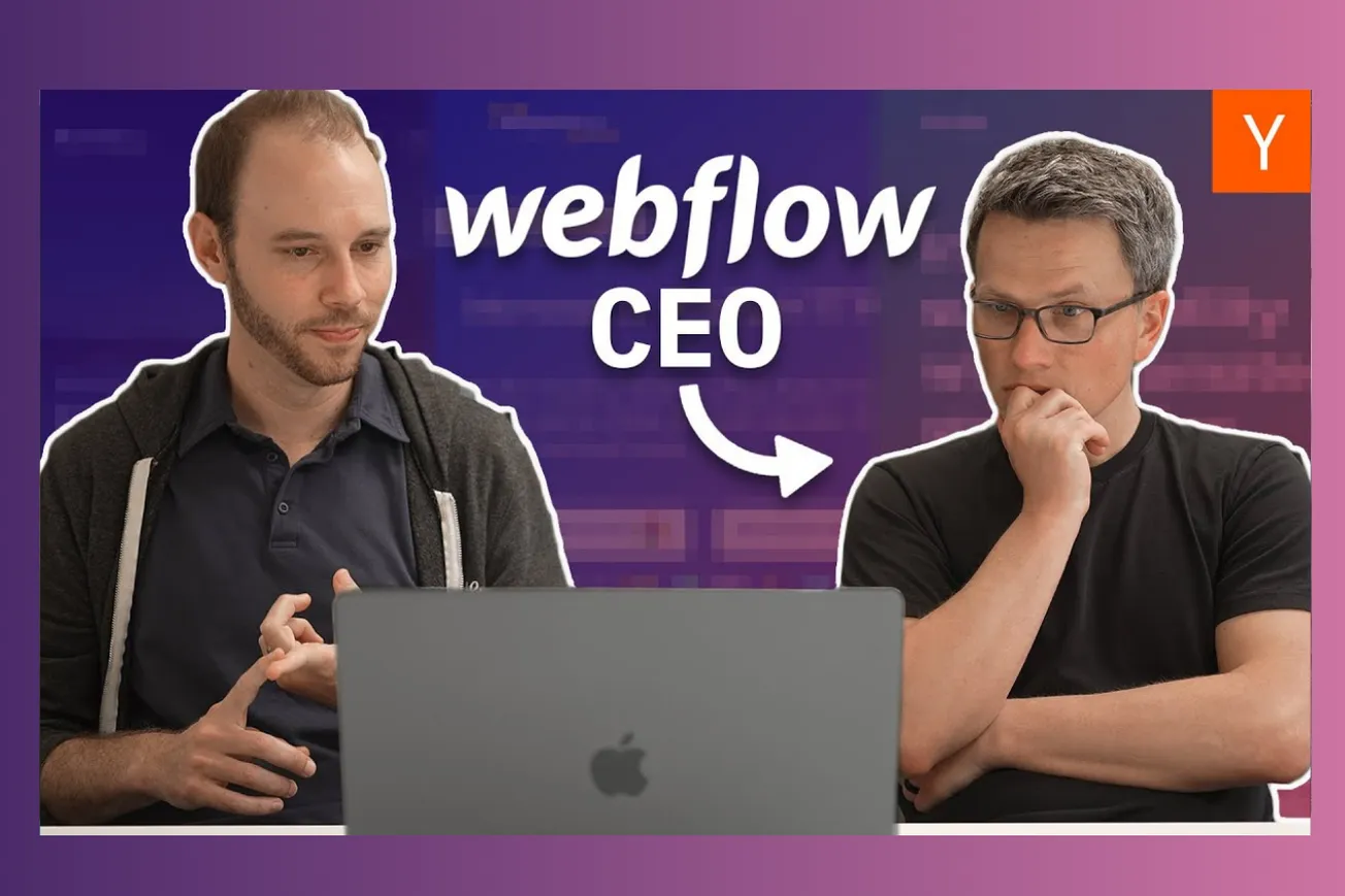
Y Combinator's Aaron and Webflow CEO Vlad dissect common website design failures that prevent startups from converting visitors into customers, revealing critical insights every founder needs.
Key Takeaways
- Value propositions must be crystal clear within seconds—visitors shouldn't have to decode what your product does
- Target audience confusion kills conversions faster than poor design—pick one primary user and speak directly to them
- Headlines tell your story as users scroll—make each one standalone and compelling
- Social proof works best when it includes faces, names, and real companies rather than anonymous testimonials
- Animations and moving elements can distract from your core message if not strategically placed
- Professional visual design sets expectations for product quality—users judge your software by your website
- Homepage real estate is precious—bury company stats and focus on user value in the top section
- Demo experiences that let users try your product immediately outperform passive video content
- Multi-persona messaging dilutes impact—create separate landing pages for different user types
Timeline Overview
- 00:00–00:59 — Introduction and Setup: Aaron from Y Combinator and Vlad from Webflow introduce the episode, explaining they'll review websites built on Webflow to demonstrate design principles and common mistakes
- 00:59–06:25 — Oda Studio Analysis: Review of a property photo enhancement service that struggles with unclear value proposition and buried key messaging, demonstrating the importance of front-loading critical information
- 06:25–12:00 — Flycode Examination: Deep dive into a no-code product editing tool that confuses target audiences between developers and product managers, highlighting the dangers of mixed messaging
- 12:00–17:30 — Colossyan Evaluation: Assessment of an AI video generation platform that showcases good demo strategy but suffers from unclear use case targeting and overwhelming feature lists
- 17:30–23:21 — Artifact Review: Analysis of a family podcast service that excels at emotional connection and professional presentation while maintaining clear value communication throughout the user journey
- 23:21–End — Conclusion and Takeaways: Summary of key insights for startup founders about effective website design and user experience optimization
The Fatal Flaw: Unclear Value Propositions
The most devastating mistake startups make is forcing visitors to work too hard to understand what they actually do. Oda Studio exemplifies this problem perfectly—despite having a functional product that enhances property photos, their homepage leaves viewers confused about whether they're photographers, software providers, or something else entirely.
When Aaron and Vlad first encountered Oda Studio's site, both experts struggled to decode the basic value proposition. The tagline "stand out with your property photos" proved too generic, and the homepage buried crucial details about AI-powered photo enhancement beneath vague corporate messaging.
The breakthrough came when they discovered a hidden landing page specifically for property managers. This page immediately clarified the product as "premium virtual staging" with before-and-after sliders showing exactly how the technology transforms photos. The contrast was stark—what took minutes to understand on the homepage became instantly clear on the targeted page.
- Visitors make snap judgments within 3-5 seconds of landing on your site—confusion during this window usually means permanent loss
- Generic taglines like "stand out with your photos" could apply to hundreds of different businesses and provide no competitive differentiation
- Before-and-after demonstrations work powerfully for transformation products, showing rather than telling what the software accomplishes
- Company statistics and generic value props should never occupy prime homepage real estate when visitors don't yet understand your basic function
- Hidden landing pages with better messaging indicate that founders know how to communicate clearly but aren't applying that knowledge consistently
The solution requires ruthless prioritization of information hierarchy. Everything above the fold should answer two fundamental questions: "What is this?" and "Is this for me?" Only after establishing clarity should sites introduce supporting elements like social proof, detailed features, or company metrics.
Successful startups front-load their most compelling evidence. For transformation products like Oda Studio, this means leading with visual proof of results rather than abstract promises about quality or efficiency.
Target Audience Confusion: The Conversion Killer
Flycode demonstrates how trying to serve multiple audiences simultaneously can paralyze conversion optimization. Their website attempts to appeal to both developers seeking freedom from product requests and product managers wanting to make changes without coding—two potentially conflicting value propositions that muddy the water for both groups.
The homepage headline "We free developers from product edits" suggests the primary beneficiary is engineering teams looking to reduce interruptions. However, scrolling down reveals messaging focused on product teams making changes without developer involvement. This creates confusion about who should actually sign up for the service.
From a developer's perspective, seeing "for product teams" messaging might signal that this tool isn't relevant to their workflow. Product managers encountering developer-focused headlines might assume the tool requires technical expertise they don't possess. Neither group feels confident that the product addresses their specific needs.
- Multi-audience messaging forces visitors to self-select their relevance, adding cognitive load that reduces conversion rates
- Conflicting value propositions within the same page suggest unfocused product strategy and unclear market positioning
- Professional buyers want to know immediately whether a solution fits their role and responsibilities—ambiguity triggers abandonment
- Developer-focused and business-focused audiences often have opposing priorities and communication preferences
- Generic corporate language that tries to please everyone typically resonates with no one
The webflow approach validates this insight through their own evolution. Rather than positioning as a tool "for designers and developers," they've focused primarily on empowering designers while building features that make developer handoffs smoother. This clarity attracts their core audience while providing pathways for secondary users.
Successful startups typically start with intense focus on one primary user type, then expand messaging once they've achieved strong product-market fit. Attempting to serve multiple masters from day one usually results in serving none of them effectively.
The Power of Strategic Social Proof
Artifact showcases how authentic social proof can transform visitor confidence and drive conversion decisions. Their homepage features coverage from Today Show, CBS, Wirecutter, and Wall Street Journal—impressive media validation that immediately signals legitimacy and market traction.
The key difference between Artifact's approach and typical startup social proof lies in authenticity and relevance. Rather than displaying generic customer testimonials or anonymous review scores, they showcase recognizable media brands that visitors already trust. This borrowed credibility transfers directly to their product evaluation.
Even more effective is their integration of actual customer reviews with specific details: "1000+ reviews, nearly five stars." This combination of quantity and quality metrics provides concrete evidence of customer satisfaction while demonstrating scale.
- Recognizable brand logos carry more conversion power than anonymous testimonials because visitors already have trust relationships with known entities
- Media coverage serves as third-party validation that professional journalists have vetted and endorsed your solution
- Specific metrics like "1000+ reviews" prove scale better than vague claims about customer happiness
- Face-and-name testimonials outperform anonymous quotes because they imply real people willing to stake their reputation on your product
- Social proof placement matters—too early in the funnel and it seems premature, too late and visitors have already made abandonment decisions
The psychology behind social proof stems from uncertainty reduction. B2B buyers especially need reassurance that they're making defensible decisions that won't reflect poorly on their judgment. Seeing that reputable companies or individuals have already validated a solution dramatically reduces perceived risk.
Colossian attempts similar validation with user testimonials but falls short by presenting too much text without clear attribution. Long testimonial blocks become skippable content rather than trust signals, particularly when visitors don't recognize the quoted individuals or companies.
Animation and Visual Distraction: When Design Hurts Conversion
Flycode's homepage demonstrates how well-intentioned visual elements can undermine core messaging. Their animated countdown timer draws immediate attention but distracts from the value proposition visitors actually need to understand. This misallocation of visual hierarchy creates confusion rather than clarity.
Animation serves important purposes in web design—guiding attention, demonstrating functionality, or creating emotional engagement. However, movement always captures user focus, so animated elements must strategically highlight your most important messages rather than decorative features.
The three-minute timer presumably indicates quick setup time, which could be valuable information for busy product managers. However, the animation treatment makes this secondary benefit compete with primary value proposition communication, splitting visitor attention during the crucial first few seconds.
- Human eyes are biologically programmed to notice movement, making animation impossible to ignore regardless of its relevance to user goals
- Animated elements should only highlight information that directly supports conversion decisions—features, benefits, or calls-to-action
- Decorative animations often signal amateur design to professional buyers who expect streamlined, purpose-driven experiences
- Loading animations that serve no functional purpose can make sites feel slower and less professional
- Movement without meaning creates cognitive load that detracts from message comprehension
Webflow's own design philosophy emphasizes purposeful animation that enhances rather than distracts from core messaging. Their homepage animations demonstrate product capabilities rather than serving purely aesthetic functions.
The solution involves auditing every moving element against conversion priorities. Does this animation help visitors understand what the product does? Does it support the primary call-to-action? If not, static design elements likely serve users better.
Demo Strategy: Show Don't Tell
Colossian's homepage exemplifies effective demo strategy by immediately showcasing their AI video generation capability. Rather than describing their technology or listing features, they lead with a 15-second video demonstration that lets visitors immediately assess quality and relevance.
This approach works particularly well for products where quality perception drives adoption decisions. AI-generated content often suffers from "uncanny valley" effects that words cannot adequately convey—only direct demonstration reveals whether output meets user standards.
The 15-second duration proves strategic because it respects visitor time while providing sufficient evidence for initial evaluation. Longer demos risk abandonment, while shorter clips might not demonstrate enough capability to build confidence.
- Product demonstrations reduce uncertainty more effectively than feature descriptions because they provide direct evidence of capabilities
- Quality-dependent products must prove rather than promise their value through immediate user experience
- Short demonstration videos accommodate modern attention spans while providing substantive proof points
- Self-service demos that let visitors try the product immediately outperform passive video content by creating investment and ownership
- Demo placement at the top of the page acknowledges that most visitors want to evaluate product quality before reading detailed explanations
Artifact takes a different but equally effective approach by embedding playable podcast samples directly into their content flow. Visitors can immediately experience the product quality without navigating to separate demo pages or signing up for trials.
The contrast with Oda Studio proves illuminating—their hidden before-and-after sliders provide compelling demonstration once discovered, but burying this content below generic messaging reduces its impact significantly.
Content Hierarchy: Headlines Tell Your Story
Vlad's observation about headline scanning behavior reveals crucial insights about user reading patterns. Most visitors don't read body copy linearly—instead, they scan headlines and subheadings to quickly evaluate relevance before committing to deeper engagement.
This scanning behavior means your headlines must tell a complete, compelling story even when read in isolation. Each headline should advance the narrative and provide standalone value rather than requiring previous context to make sense.
Flycode's headline progression illustrates this principle's importance: "We free developers from product edits" followed by "Make product changes without coding" creates confusion about primary beneficiaries. These headlines tell different stories about who benefits and why, forcing visitors to reconcile conflicting messages.
- Headline scanning represents the primary reading behavior for first-time visitors evaluating multiple potential solutions
- Each headline must provide standalone value and advance the conversion narrative without requiring supporting context
- Contradictory headlines suggest unfocused strategy and reduce confidence in product clarity
- Visual hierarchy through font sizes and spacing determines which text elements function as scannable headlines
- Mobile responsiveness affects headline hierarchy since smaller screens change the relative importance of different text elements
Artifact demonstrates effective headline progression: starting with emotional connection ("She only grows up once"), progressing through problem identification and solution explanation, then concluding with credibility evidence. Each headline advances the story logically while maintaining standalone comprehension.
The practical application requires mapping visitor mental progression from awareness through consideration to decision. Headlines should mirror this journey, addressing evolving questions and concerns as prospects move down the page.
Professional Design as Product Signal
Visual design quality serves as a proxy for product quality in B2B purchasing decisions. Flycode's polished, professional appearance immediately signals that competent product people have invested in user experience, creating positive expectations about the underlying software quality.
This correlation exists because professional design requires attention to detail, user empathy, and resource investment—the same qualities that produce reliable software products. Conversely, amateur-looking websites suggest corners have been cut elsewhere in the product development process.
The effect proves particularly strong for technical products where buyers cannot immediately evaluate core functionality. Professional design becomes the primary evidence available for assessing team competence and product maturity.
- B2B buyers use website quality as a risk assessment tool when evaluating vendor reliability and longevity
- Professional design implies resource investment and team competence that buyers expect to extend to product development
- Visual polish creates credibility that enables higher pricing and faster sales cycles by reducing buyer skepticism
- Amateur design elements like stock photography, default fonts, or generic layouts signal resource constraints that concern enterprise buyers
- Consistency across design elements demonstrates systematic thinking that buyers expect to find in software architecture
Artifact's pristine presentation exemplifies this principle—every element from typography to video production quality reinforces their positioning as a premium service worth subscription investment. The visual treatment supports rather than undermines their value proposition.
Conversely, Colossian's slightly unfinished interaction patterns (use case buttons that don't match content) create friction that undermines confidence in their sophisticated AI technology.
The investment in professional design pays dividends across the entire sales funnel by reducing buyer skepticism and supporting premium positioning strategies.
Mobile-First Information Architecture
Modern website design must prioritize mobile user experience since increasing percentages of B2B traffic originate from mobile devices. This shift affects information architecture because smaller screens compress visual hierarchy and change reading patterns.
Traditional desktop layouts that spread key information across wide headers become illegible on mobile devices. Information density that works on desktop creates overwhelming cognitive load on smaller screens, forcing designers to prioritize ruthlessly.
The mobile-first approach requires identifying the absolute minimum information needed for visitor conversion, then building progressive disclosure systems that reveal additional details as users demonstrate interest.
- Mobile screens force brutal prioritization of information hierarchy since space constraints eliminate the possibility of showing everything simultaneously
- Touch interfaces change interaction patterns—hover states become irrelevant while tap targets must meet minimum size requirements
- Mobile loading speeds significantly impact conversion rates since cellular connections introduce latency that desktop broadband masks
- Progressive disclosure through collapsible sections or tabbed interfaces becomes essential for mobile content organization
- Mobile-specific call-to-action placement differs from desktop optimal positions due to thumb reach considerations
The reviewed websites demonstrate varying levels of mobile optimization awareness. Artifact's clean, hierarchical design likely translates well to mobile devices, while Flycode's information-dense top section probably creates mobile usability challenges.
Testing websites across device types reveals critical conversion barriers that desktop-only analysis misses entirely.
Conclusion
The website reviews reveal that startup success depends less on advanced design techniques than on fundamental clarity and user focus. The most common failures stem from trying to communicate too much information simultaneously rather than guiding visitors through logical progression toward conversion decisions. Professional design, strategic social proof, and clear value propositions create the foundation for effective startup websites, while animation and complex features should enhance rather than replace core messaging.
The companies that succeed online understand that their website serves as their primary sales representative—it must answer visitor questions quickly, build trust efficiently, and guide prospects toward clear next steps without confusion or cognitive overload.


