Table of Contents
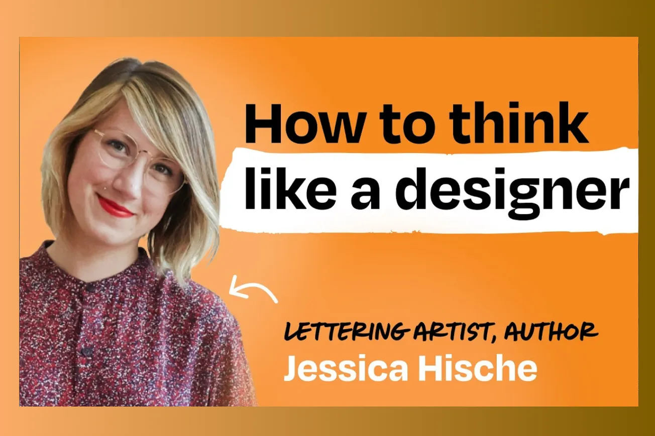
Legendary lettering artist Jessica Hische reveals how anyone can develop designer instincts for typography and logos, plus the business realities of when companies should invest in brand refreshes. Master typographer Jessica Hische breaks down the hidden psychology of fonts and logos that influence how we feel about brands.
Key Takeaways
- Most people already possess intuitive design judgment but lack vocabulary to articulate why something feels "off" about typography or logos
- Companies should focus on utilitarian logo fixes—scalability, legibility, uniqueness—rather than massive brand overhauls until they have substantial success
- The timing for logo refreshes often coincides with major rollouts: new websites, physical merchandise, or expansion to new audiences
- Typography choices communicate specific emotions through weight, spacing, edges, and cultural associations that operate below conscious awareness
- Good logo design should be simple enough that non-expert team members can use brand assets effectively without extensive guidelines
- Custom typography prevents easy copying by competitors, providing defensive value as companies gain traction and attract imitators
- The refresh process works best when starting broad with goals and gradually narrowing to technical details rather than jumping into minutiae
- Successful designers balance high-level creative vision with granular technical execution, using variety across projects to prevent burnout
- Pattern recognition drives visual judgment—humans automatically detect when something doesn't fit established visual rules or cultural expectations
Timeline Overview
- 00:00–15:30 — Introduction and Process Philosophy: Jessica explains her unique positioning as typography specialist and approach to logo refreshes that prioritize practical utility over brand exploration
- 15:30–32:45 — When to Refresh Your Logo: Practical signals indicating companies should invest in professional design work, including scalability issues and upcoming major rollouts
- 32:45–48:20 — Lenny's Logo Case Study: Detailed walkthrough of the refresh process from initial goals to final execution, including mid-process course corrections and design rationale
- 48:20–65:10 — Seeing Like a Designer: How non-designers can develop visual intuition by examining fonts and asking "what feeling does this give me?" before reverse-engineering the technical reasons
- 65:10–82:40 — Technical Typography Elements: Specific visual factors that impact emotional response including weight, spacing, edge treatment, and optical corrections that override mathematical precision
- 82:40–END — Business Model and Creative Philosophy: Unique pricing approach that separates creative exploration from rights ownership, plus insights on balancing multiple creative projects and AI's role
The Anti-Brand Brand Expert: Jessica's Contrarian Philosophy
- Jessica occupies a unique position in the design world by understanding both creative excellence and startup resource constraints. Her background working with tech companies gives her insider perspective that traditional brand agencies lack when advising founders.
- Her core philosophy challenges conventional brand thinking: "brand people are like brand is everything and you need to take a significant investment in brand because that guides the vision of the product" versus her reality-based approach that recognizes startups may need to pivot.
- The argument for "good enough" early logos stems from practical experience with startup life cycles. Companies often need basic assets for investor decks and holding pages before product-market fit, making expensive brand exploration premature investment.
- She differentiates between companies where "brand is literally everything" (those repackaging existing products for new audiences) versus companies where "the brand should be somewhat invisible so that the thing itself becomes the star."
- This positioning creates trust with founder clients because she demonstrates understanding of their actual constraints rather than pushing expensive solutions that may become obsolete if business models evolve.
- However, the framework may underestimate how early brand decisions can compound over time. While pivots do happen, strong initial branding can also help startups attract talent, customers, and investors during crucial early phases.
Tactical Triggers: When Logo Refresh Actually Makes Business Sense
What specific business moments justify design investment versus continuing with DIY approaches?
- Physical merchandise production represents a clear inflection point because printing errors or unprofessional appearance in tangible goods creates lasting negative impressions. "If you're about to print a bunch of Swag for new hires or you're hosting a conference" signals time for professional design.
- Website and app expansion phases require logo variants that work across different scales and contexts. Early-stage logos often fail when stress-tested across avatar sizes, business cards, and large-format displays.
- Competitive differentiation becomes crucial when success attracts imitators. "If you're using something that's available to everyone the chances of someone else coming in and copying you are very easy and high" because competitors can easily replicate widely available fonts and generic design approaches.
- Team growth creates internal brand touchpoints where professional assets generate both recruitment advantages and cultural cohesion. Quality design signals operational sophistication to potential hires who evaluate companies across multiple dimensions.
- Customer expansion efforts benefit from visual signals that communicate evolution without alienating existing users. "We're trying to expand it so then it's about what can we do to shift the vibe to make it include these new people without excluding our core folks."
- The framework emphasizes utilitarian rather than aspirational triggers, though it may undervalue how early brand strength can accelerate growth by creating memorable differentiation in crowded markets.
The Refresh Process: From Broad Vision to Precise Execution
How do professional designers navigate the balance between creative exploration and practical constraints?
- The initial scoping conversation determines whether clients need "close-in" technical fixes or broader strategic repositioning. This prevents misaligned expectations and ensures appropriate resource allocation for different types of challenges.
- Jessica's willingness to provide work-in-progress files for client testing represents unusual trust but enables rapid iteration cycles. "Most other people are like no you don't get the files until we do the final" creates artificial delays that may miss market timing.
- The "frankensteining" approach allows mixing and matching different design elements rather than forcing binary choices. This flexibility acknowledges that design decisions often require seeing combinations before knowing what works best.
- Client course corrections mid-process are treated as natural rather than problematic. "You as a person that has design eye can see all the problems with it and I need to roll something out that fixes the problems that I see but that no one else really notices."
- The narrowing process from broad concepts to technical details prevents getting lost in minutiae before establishing overall direction. Starting with "big picture before minutia" ensures foundational decisions align with business objectives.
- However, this collaborative approach requires clients capable of design judgment and clear communication. The method may be less effective with indecisive stakeholders or unclear business objectives that make consistent feedback difficult.
Developing Designer Vision: The Pattern Recognition Training
Can non-designers actually learn to see visual relationships that drive emotional responses?
- Human pattern recognition operates continuously below conscious awareness, making everyone capable of detecting visual "wrongness" even without technical vocabulary. "Even as a non-designer I think you can look at examples of logos where something's not quite right and be like something's not right here I just don't know how to name it."
- The font feeling exercise provides concrete training: examine typefaces and write down emotional responses before analyzing technical similarities. This develops awareness of how visual elements translate to psychological impressions.
- Cultural associations explain why certain styles feel aligned with specific industries or contexts. Wedding invitation scripts feel "inherently bridey versus groomy" because repeated exposure creates unconscious categorization systems.
- Competitive landscape analysis reveals how visual choices position brands relative to industry norms. Companies can either "lean into" category conventions for immediate recognition or deliberately "avoid that" to signal differentiation.
- The exercise of blurring vision eliminates distracting details and forces attention to overall visual impression. This simulates how logos function in real-world conditions where people glance quickly rather than studying carefully.
- While the pattern recognition concept has validity, individual cultural backgrounds significantly influence associations. The framework may not account for how diverse experiences create different emotional responses to identical visual elements.
Technical Typography: The Optical Illusions Behind Perfect Letters
Why do mathematically perfect letterforms often look wrong to human perception?
- Geometric sans serifs appear regular but contain numerous optical corrections that make them look mathematically precise while violating actual mathematical rules. These adjustments compensate for how human vision processes letterform relationships.
- Stroke weight management becomes critical where letterforms connect. "When Strokes combine so say I have an A and I'm combining the lower bowl of the a I'm going to get a little thinner as I come into that" prevents visual "inky moments" that appear too heavy.
- Lowercase letters require more optical adjustments than uppercase because their smaller size demands weight accommodation. The technical complexity increases with bolder typefaces that create more challenging visual weight distribution.
- Engineering backgrounds often produce overly regular typography because systematic thinking doesn't account for perceptual psychology. "I can always tell when there's an engineer that has suddenly got taken an interest in type design" because everything follows perfect grids.
- The exercise of examining single letters at large scale reveals these corrections. Drawing circles or vertical lines over letterforms exposes how "perfect" typography actually contains numerous intentional imperfections.
- This technical knowledge distinguishes professional from amateur typography work, though the practical impact on business outcomes may be minimal for most applications. The expertise provides defensive value against criticism rather than driving customer conversion.
Business Model Innovation: Separating Creation from Ownership
How does restructuring design pricing align incentives while reducing client risk?
- Traditional branding agencies build ownership costs into every round of work, making iteration expensive because clients pay buyout fees throughout the process. Jessica's model separates creative exploration from rights acquisition to enable more experimentation.
- The approach allows stakeholder disruption without financial penalty. "If some stakeholder comes in last minute and blows everything else up and we need to start over you haven't already paid to own everything that we've created."
- Project scalability depends on exploration scope rather than fixed deliverables. Budget-constrained clients can engage for final polish while better-funded companies can invest in broader strategic development.
- Collaboration emphasis prevents internal team displacement. "Sometimes companies have these really amazing designers that are working in house and it sucks as a designer who started at a company" if external consultants displace internal opportunities.
- The pricing range of $25,000-$35,000 positions professional design as accessible rather than luxury service. This democratizes quality design for growing companies that can't justify six-figure brand investments.
- However, the model requires high trust and may not scale across different client types. Large corporations may prefer traditional buyout structures that provide clearer ownership certainty and standardized procurement processes.
The Multi-Hyphenate Creative: Sustaining Long-term Artistic Practice
How does project variety prevent creative burnout while maintaining professional excellence?
- Jessica's diverse portfolio—typography, children's books, physical retail—provides different types of mental stimulation that prevent the monotony of specialized expertise. Each project type "tickles different parts of my brain" and requires different skills.
- The productivity strategy involves switching between projects when motivation wanes rather than taking traditional breaks. "Rather than taking breaks I just take a break by working on something that feels fresh" maintains momentum while providing psychological variety.
- Physical creation through printmaking and retail provides tactile balance to digital design work. The Oakland store creates direct customer relationships that inform and inspire commercial client work.
- Children's book writing allows exploration of therapeutic concepts and educational content outside commercial constraints. This creative outlet maintains artistic satisfaction while building different revenue streams.
- The business model accommodates different engagement levels based on client needs and project phases. Some clients need full strategic development while others require only technical execution of existing concepts.
- While this portfolio approach provides creative sustainability, it may limit specialization depth and create operational complexity. Managing multiple business lines requires diverse skill sets that could dilute focus on core competencies.
Common Questions
Q: How long should companies wait before investing in professional logo design?
A: Wait for specific business triggers like physical merchandise production, major website launches, or competitive copying concerns rather than arbitrary time periods or funding milestones.
Q: Can non-designers really develop reliable judgment about typography and visual design?
A: Pattern recognition operates unconsciously for everyone, but developing articulate judgment requires systematic practice examining typefaces and reverse-engineering emotional responses.
Q: How much should early-stage companies budget for logo refresh work?
A: Professional refresh work typically ranges $25,000-$35,000 depending on scope, while simple fixes or consultative support can cost significantly less than full rebrand projects.
Q: What's the biggest mistake companies make when approaching logo design?
A: Starting with technical minutiae rather than establishing broad goals and overall direction before narrowing to specific execution details.
Q: How do you balance creative vision with practical business constraints?
A: Separate creative exploration from rights ownership to enable experimentation, and maintain clear communication about goals throughout the process rather than surprising clients with unexpected directions.
Conclusion
Jessica Hische's approach to design consulting demonstrates how deep technical expertise can be combined with practical business understanding to serve growing companies effectively. Her emphasis on utilitarian triggers over aspirational brand investment reflects realistic resource allocation for most startups while maintaining standards for professional quality. The framework for developing design judgment through pattern recognition and emotional response analysis provides accessible entry points for non-designers who need to make visual decisions.
However, her contrarian stance on early brand investment may underestimate how visual differentiation can accelerate growth in competitive markets. The collaborative process model requires clients capable of providing clear feedback and direction, which may limit applicability across different organizational contexts. The multi-project approach to creative sustainability offers valuable insights for maintaining long-term artistic practice while building diverse revenue streams.
Practical Implications
• Delay major brand investment until specific business triggers like physical merchandise or competitive copying concerns emerge
• Develop visual judgment by examining typefaces and documenting emotional responses before analyzing technical similarities
• Start design projects with broad goal-setting and gradually narrow to technical details rather than jumping into minutiae
• Consider separating creative exploration from rights ownership to enable more experimentation within budget constraints
• Focus logo decisions on utilitarian factors like scalability and uniqueness rather than purely aesthetic preferences
• Use pattern recognition training to understand how cultural associations influence visual perception and brand positioning
• Maintain project variety and switching strategies to prevent creative burnout while sustaining high-quality output
• Evaluate competitive landscape visual choices to either align with category norms or deliberately differentiate
• Invest in custom typography when success attracts imitators who might copy easily available design elements


