
Table of Contents
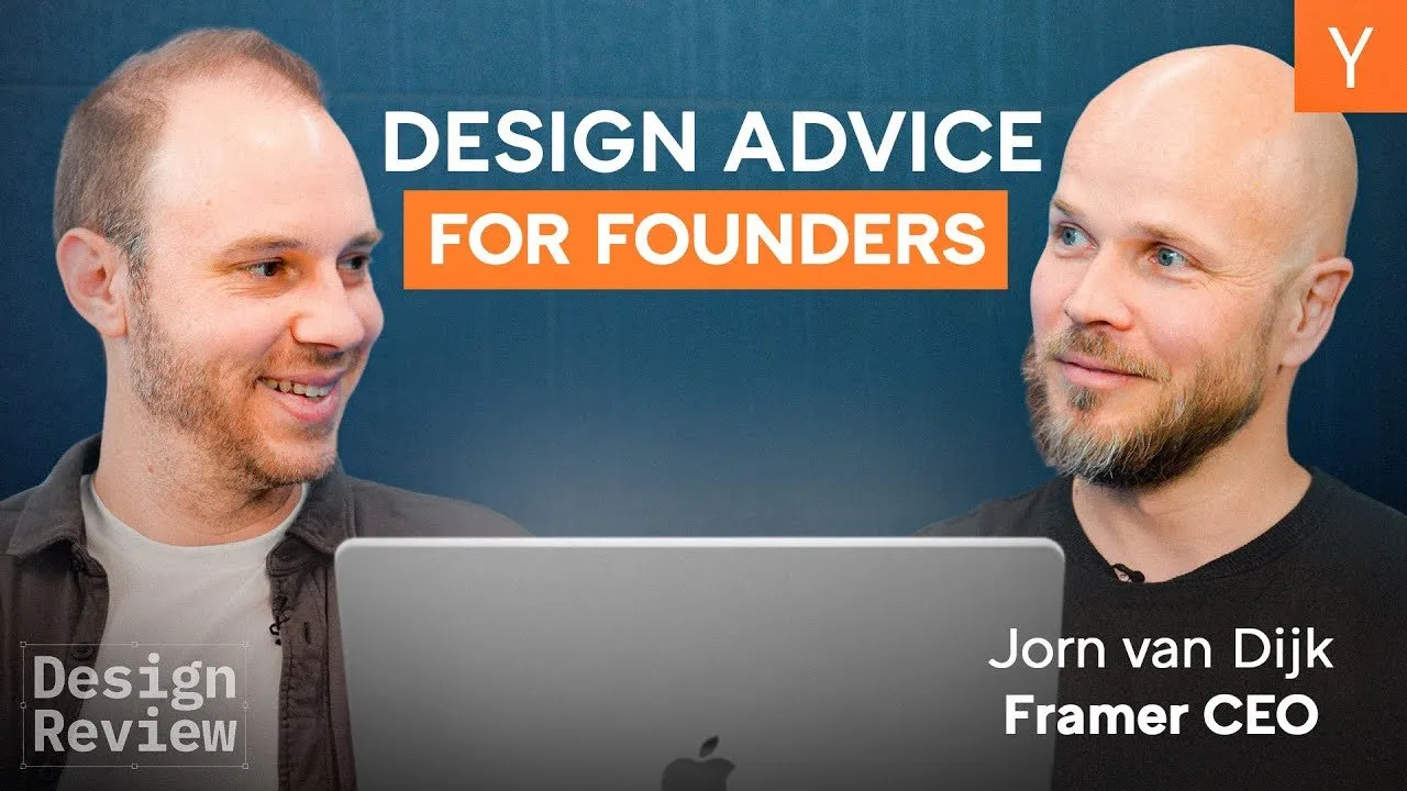
Designing a high-converting landing page is one of the most difficult challenges for early-stage startups. You have mere seconds to capture attention, explain a complex value proposition, and convince a visitor to take action. To explore what separates successful designs from confusing user experiences, Yorn Van Djk, CEO and co-founder of Framer, joined a design review session to critique real-world startup websites. Drawing from his expert background, Van Djk provided actionable feedback on everything from animation speeds to the psychology of "Book a Demo" buttons.
The following analysis breaks down the core design principles discussed during the session, offering a blueprint for founders and designers looking to elevate their web presence.
Key Takeaways
- Show the actual product immediately: Abstract illustrations and generic motion graphics often fail to communicate value. Users trust screenshots and video walkthroughs over vague iconography.
- Delay the friction: Forcing a login or a demo booking before the user experiences an "aha" moment significantly lowers conversion rates. Allow users to test the tool directly in the browser first.
- Animation requires intent: Motion should be used to guide the eye to key actions (like a pulsing call-to-action) rather than for decoration, which often distracts from the message.
- Align aesthetics with the customer: The visual language must match the target audience. Enterprise solutions should look robust and scalable, while human-centric tools need warmth and connection.
- Micro-details signal competence: Inconsistent spacing, typography errors, or unnatural testimonials subconsciously tell visitors that the company lacks attention to detail.
The "Show, Don't Tell" Imperative
One of the most consistent themes throughout the review was the necessity of grounding abstract concepts in reality. Many startups fall into the trap of using sleek, abstract animations to represent their software, leaving new visitors guessing about what the tool actually does.
Replacing Generic Graphics with UI
In the review of Lumari, a procurement AI platform, the homepage relied heavily on animated icons and "vague generic graphics." While visually cohesive, these elements failed to anchor the product in reality. Van Djk noted that for a complex B2B tool, visitors need tangible evidence of how the workflow operates before they are willing to commit time to a sales call.
"I'm not going to book a demo without getting just a little bit of a taste of what the product looks like and how it works. So, either just a screenshot or a collection of screenshots or a short, two-minute video walkthrough."
Similarly, for Alai, a presentation deck builder, the hero video simplified the interface to the point of abstraction. By removing the actual UI to make the video look cleaner, the company inadvertently made it harder for users to understand the tool's capabilities. The feedback was clear: do not over-simplify to the point of obfuscation. Show the dashboard, the controls, and the output.
Reducing Friction and the "Aha" Moment
A critical error observed across multiple sites was the placement of "high friction" barriers before the user understood the value proposition. In an era where competitors like Google Slides or ChatGPT are free and accessible, asking for a signup or a scheduled call too early can be fatal to conversion.
The Problem with "Book a Demo"
For Lumari, the primary call to action (CTA) was "Book a Demo." Van Djk argued that this is too dramatic a request for a first-time visitor. It demands 20 minutes of a user’s time before the site has effectively proven the product's worth. A better approach is to use the CTA space to show a product walkthrough, effectively selling the user on the solution before asking for the meeting.
Unlocking the Product Experience
The review of Juicebox, an AI recruiting platform, highlighted a missed opportunity in user acquisition. The site featured an engaging prompt box asking, "Who are you looking to hire?" However, upon entering a query, the user was immediately hit with a signup wall. This interruption kills momentum.
The suggested strategy is to allow the user to see the results—even if they are blurred or limited—before asking for an email address. This establishes the value (the "aha" moment) first, making the user much more willing to exchange their contact information to access the full data.
"This is like the biggest blocker you could possibly put up... How can you get somebody to experience the value of the product as quickly as possible?"
Purposeful Animation vs. Distraction
Framer is known for its animation capabilities, yet the CEO cautioned against using motion without a clear purpose. Animation should be a functional tool for user experience (UX) design, not just decoration.
Guiding the Eye
Leaping AI provided a strong example of animation done correctly. The site used a pulsing effect behind the "Click to Answer" button, subtly guiding the user’s attention to the interactive demo. Furthermore, as the user scrolled, the interface expanded immersively, creating a sense of depth that kept the user engaged.
Conversely, when animations are too fast or chaotic, they overwhelm the content. On the Lumari site, a "ticker" effect on the partner logos moved so quickly it became unreadable. The advice was to slow down transitions and ensure that every movement serves to clarify the message rather than compete for attention.
Aligning Brand Aesthetics with the Buyer
A website’s visual style sets expectations about the product’s scale, reliability, and function. A mismatch between the visual narrative and the written copy can cause cognitive dissonance for the buyer.
Enterprise Scale vs. Consumer Vibes
Leaping AI positioned itself as a solution for complex, large-scale call centers. However, the visuals featured a single iPhone and one person, creating a "consumer app" aesthetic. To sell to an enterprise, the imagery needs to reflect the scale of the problem—visualizing busy call centers or distributed systems rather than a single device.
Humanizing the Abstract
Juicebox utilized a trendy, "brutalist" design style with sharp edges and minimal color. While aesthetically modern, it felt disconnected from the product's core purpose: hiring people. The lack of human faces and the "cold" design clashed with the warm, relationship-based nature of recruiting. The critique emphasized that while being on-trend is good, the vibe must match the service being sold.
Credibility lies in the Details
Finally, the review of The Hog (a growth-as-a-service platform) served as a case study in how lack of polish can undermine trust. Several micro-failures in design accumulated to create a feeling of illegitimacy:
- Typography Errors: Inconsistent spacing between words and erratic kerning suggested that the creators were not detail-oriented.
- Unbelievable Testimonials: Quotes where every word was capitalized felt robotic and manufactured, leading the reviewers to doubt their authenticity.
- Overwhelming Layout: Trying to say everything on one page resulted in a cluttered, noisy experience.
Van Djk pointed out that visitors subconsciously pick up on these details. If the website spacing is sloppy, a potential client might assume the code or the service is equally sloppy.
Conclusion
The overarching lesson from this design review is the power of clarity and simplification. Whether it is removing necessary animations, simplifying the path to trying the product, or ensuring the typography is pixel-perfect, the goal is to reduce cognitive load for the visitor.
Founders often feel the need to "beat people over the head" with every feature their product offers. However, the most effective sites are those that respect the user's time by showing the product clearly, matching the aesthetic to the use case, and removing barriers to entry. As Van Djk summarized regarding cluttered sites: put the current page aside, start fresh, and only add back the elements that actively help a stranger understand what the product is.


